If the accuracy of colour reproduction of displays has to be tested, colours have been represented in a chromaticity diagram for many years. Such a diagram shows all colours visible to the human eye on a two-dimensional representation (see also earlier article on this topic).
A representation in a three-dimensional space with the luminance Y as third dimension is not provided in the chromaticity diagram. A spatial representation as colour volume is not new but was not necessarily essential for SDR (Standard Dynamic Range) due to the lower range in luminance. HDR (High Dynamic Range) accommodates more details in dark areas in addition to the much brighter highlights. It is usually associated with an extended colour space with even more intense colours (WCG, Wide Colour Gamut). This combination of HDR and WCG is also referred to as “HDR colours” throughout the text. With the move from SDR to HDR colours and the corresponding higher luminance range of HDR there seems to be a need to visualise and evaluate certain measurements in 3D as well.
Why is this important?
An Example:
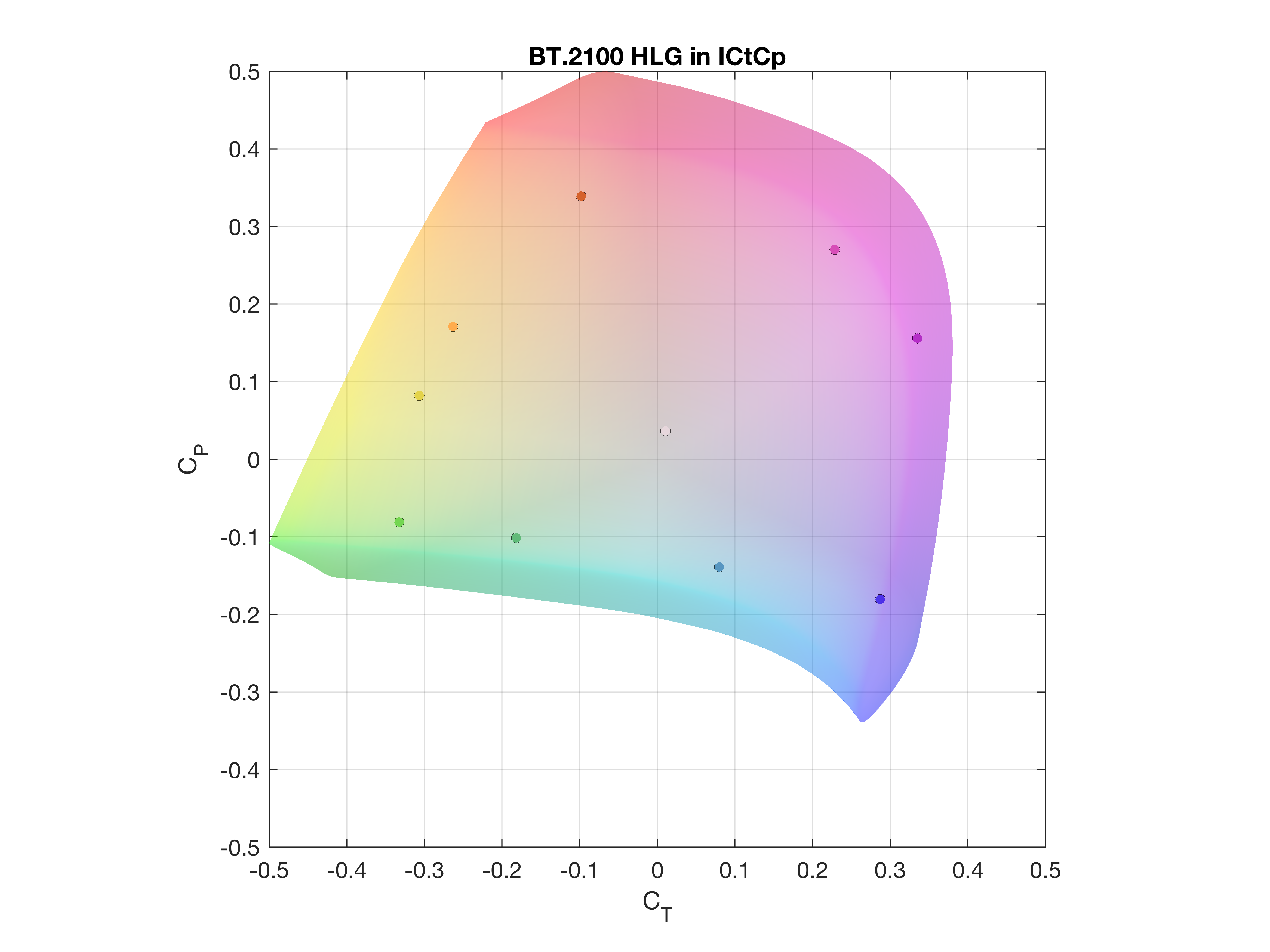
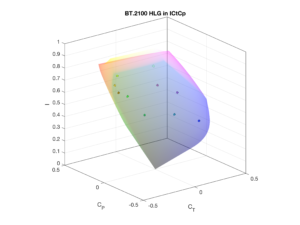
The EBU has specified additional colours in 2019 (so-called HDR colours, see EBU Tech 3325 s1).
These are specifically chosen to measure HDR WCG monitors. The colours are outside
the range of the (previous) SDR colour gamut (ITU-R BT.709), but within the
new, larger HDR colour gamut (defined in ITU-R BT.2100).
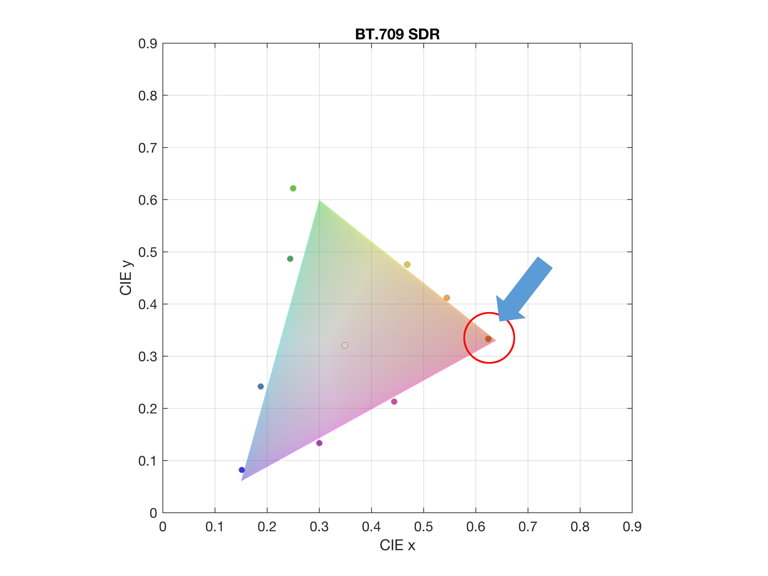
In the two-dimensional representation (picture on the left part of figure 1, the triangle corresponds to the “smaller” SDR colour gamut according to ITU-R BT.709, the coloured dots are the new EBU HDR test colours) it is not possible to estimate whether all new HDR colours are actually located outside the SDR colour gamut, as required. Especially the dot in the red corner of the triangle does not seem to fulfil this condition according to the two-dimensional representation. If the missing third dimension (luminance) is taken into account and the result is viewed in three dimensions, it is obvious that this point is clearly outside the SDR colour space and was thus correctly defined according to the requirements.
-

- Top view: New EBU HDR-colours in relation to the SDR colour volume (BT.709)
-

- 3D: New EBU HDR-colours in relation to the SDR colour volume (BT.709)
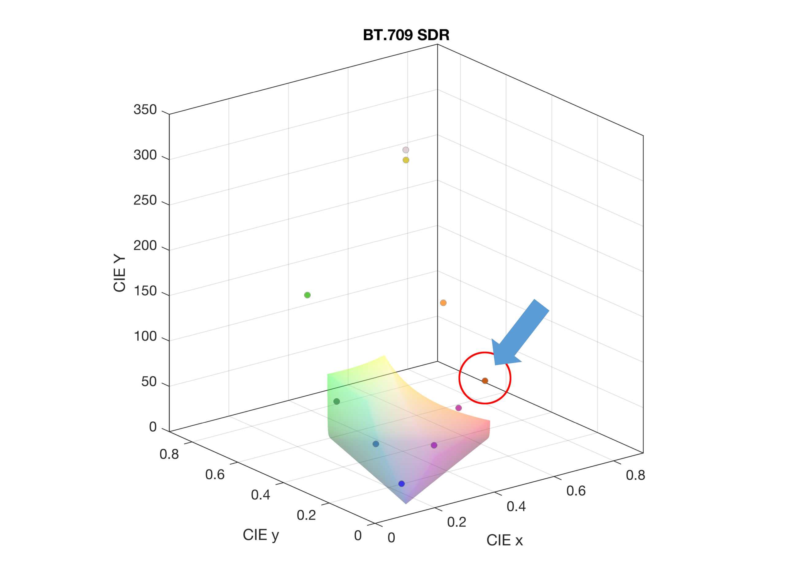
Figure 1: New EBU HDR-colours in relation to the SDR colour volume (BT.709)
Measuring a display
However, this problem is not limited to the example shown above. It is also present in every evaluation of a display measurement. If a display has to be measured previously defined signal values (like the HDR colours) with expected reference values are fed to a device under test. The display shows these signal values according to its capabilities. The goal of such a measurement is to assess whether the display can achieve the values in the test or by how many “units” the display deviates by comparing the specified and measured values.
For this purpose, there are different models to determine the distance between the reference and the measured colour as a numerical delta value. For example, in certain EBU documents (e. g. Tech 3320 and Tech 3325) the colour differences and tolerances are given as ∆u*v* (on a plane, i.e. two-dimensional) or as ∆E*uv (in space, i.e. three-dimensional).
Different metrics for colour perception
The IRT has done research on the evaluation of standards in terms of perceptible colour differences (e.g. ∆EITP, ∆u*v*, ∆E*uv, ∆E00, ∆Ez). We have asked ourselves whether the current system of colour difference metrics (∆u*v*) is still suitable in the future or whether it should be replaced by another method in the context of HDR and WCG. A further aspect of the topic was the question whether the currently defined tolerances for colour reproduction are still valid for HDR (and WCG). Or whether the tolerances should be adapted or even replaced by other tolerance metrics due to the higher dynamic range, which is directly related to colour perception. Subjective tests were performed for this purpose.
During the work it turned out that ∆u*v* as a colour difference metric for HDR is less suitable to numerically capture colour differences. This is especially a problem as ∆u*v* is calculated as a function of the maximum screen luminance. Thus, ∆u*v* may give different results for an apparently identical colour reproduction of two monitors as soon as the maximum luminance of the monitors differs. ∆EITP (based on ICtCp) represents a more suitable assessment basis for HDR in the future. ICtCp is a colour representation format that is already specified in ITU-R BT.2100 and was originally developed by Dolby.
Conclusion?
Compared to ∆u*v*, ∆EITP offers a much better accuracy at low as well as high luminance, especially outside the SDR colour space (ITU-R BT.709). This is mainly related to the colour representation format ICtCp. As a basis for developing the ICtCp colour representation format the LMS colour space was used which imitates the spectral sensitivity of the cones (colour receptors) in the human eye. ICtCp accordingly exhibits better visual homogeneity not only in colour but also in luminance. Another delta value tested in the study was ∆E00 (also known as CIEDE2000) which has similar issues as ∆u*v* and is also more complex to calculate. These and other reasons suggest that the objective colour difference metric ∆EITP provides more meaningful results when used in HDR WCG colour spaces.
But there is a catch. ∆EITP, which comes from ICtCp as mentioned above, has the feature that the luminance is separated from the chromaticity. This is different for ∆u*v*, where the lightness is included in the chromaticity u* and v*. With this approach, at least for SDR, a difference in brightness can be represented quite acceptably in the form of a colour difference. In order to be able to represent a difference in luminance with ∆EITP as well, it is highly recommended, especially for HDR, that colours and colour differences should be considered in three-dimensional space. It is no longer sufficient to visualise the colours only in a 2D representation (i. e. the top view of the colour volume), as the luminance component is not visible in a 2D representation. The latter, however, has a strong influence on colour perception since colours appear/act differently when they are varied in luminance.
The results of the colour difference metrics described in this article were gathered during the master thesis by Justin Hug at IRT in 2020. The visualization of the colour volumes has been created by Wolfgang Dilg. Mathematical background as well as calculation for the colour volumes was done by Birgit Schmidt-Sodingen. The work was coordinated in the project “Future Video” lead by Dagmar Driesnack.
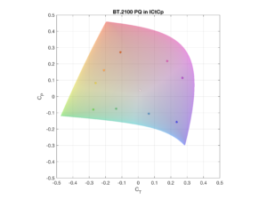
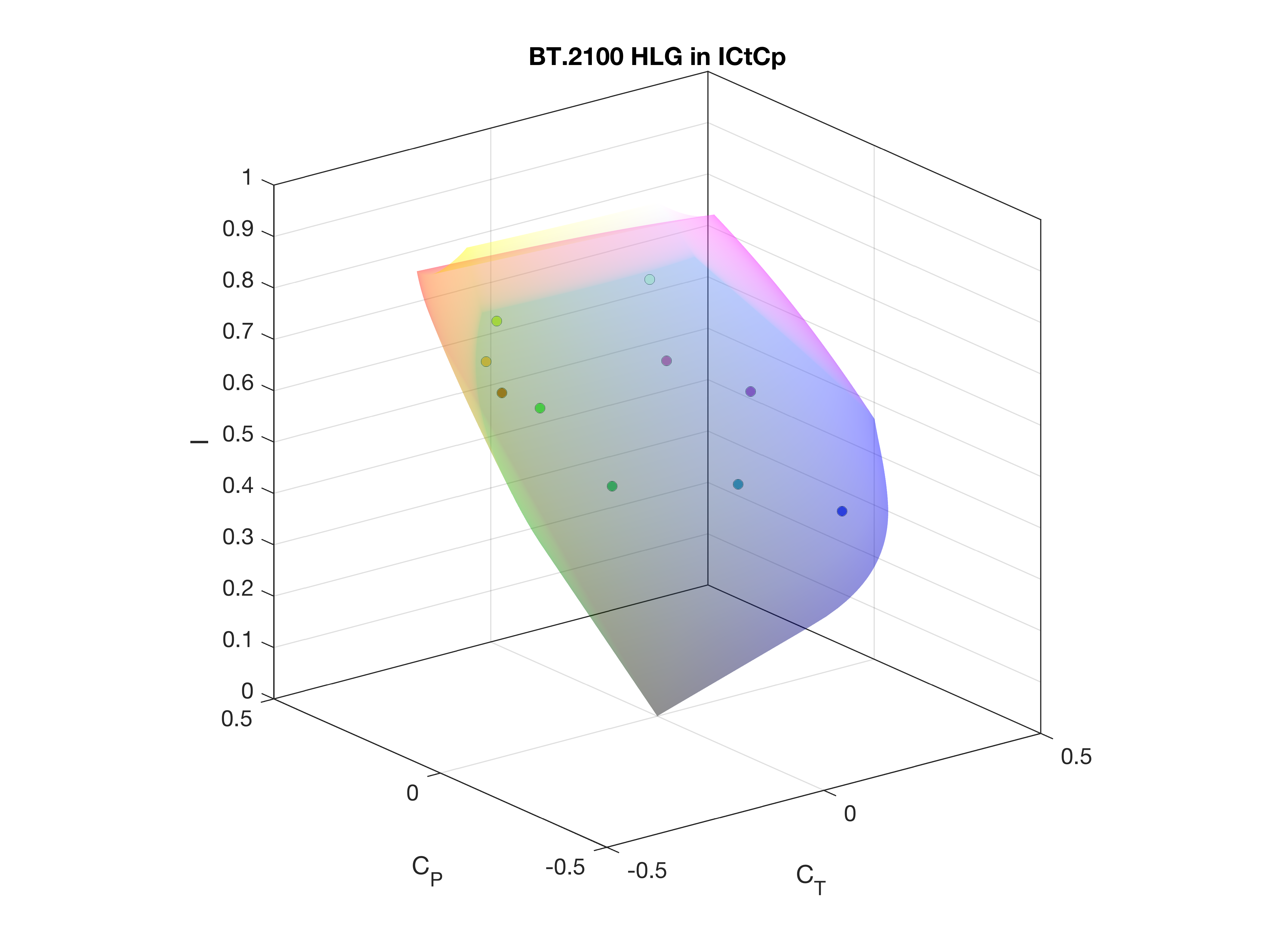
ICtCp colour volumes
For the experts reading this article, here are some colour volumes in ICtCp developed
at IRT for research. Looking to PQ it is known that the PQ system is designed up to
a peak luminance of 10.000 cd/m². For the sake of comparing PQ with HLG at 1.000
cd/m² we’ve added this peak luminance to our 3D models.
Please be aware that the coloured volumes in the videos below are just an indication
and not the absolute colours.
-
- Top view: BT.2100 PQ @10.000nits

-
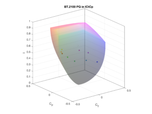
- 3D: BT.2100 PQ @10.000nits

-
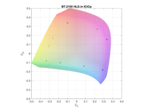
- Top view: BT.2100 HLG @1.000 nits
-
- 3D: BT.2100 HLG @1.000 nits
More colour volumes
Click here to see some more colour volumes developed at IRT:
BT.2100 HLG
BT.2100 PQ
BT.709 SDR